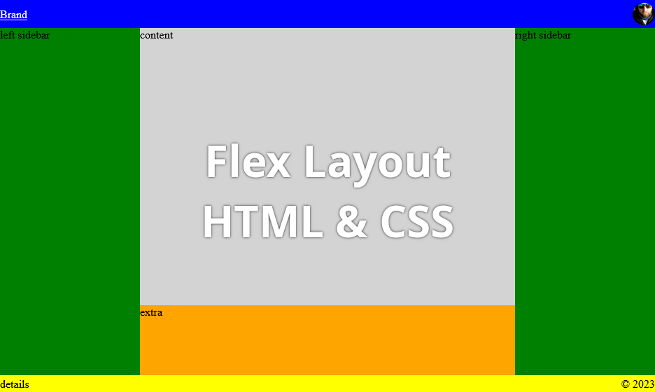
Once again looking for a flex layout cheatsheet or example?
Yeah, been there done that.
Here’s the sample I made to have a boilerplate of a Flex Layout ready to be used for some sort of a admin website etc. Code has been tested on both desktop and mobile browsers.
Please note using the 100dvh CSS parameter for adjusting height of the flexbox.
Feel free to use it as a reference and please don’t mind the colours 🙂
HTML
<!DOCTYPE html>
<html lang="en">
<head>
<meta charset="UTF-8">
<meta name="viewport" content="viewport-fit=cover, width=device-width, initial-scale=1.0, minimum-scale=1.0, maximum-scale=1.0, user-scalable=no"/>
<meta http-equiv="X-UA-Compatible" content="ie=edge">
<title>Flex</title>
<link rel="stylesheet" href="flex.css">
</head>
<body>
<div class="wrapper">
<div class="header">
<a class="brand" href="">Brand</a>
<a class="avatar" href="">
<img src="https://www.gravatar.com/avatar/253a316324510bf0337286f89f8199fc "/>
</a>
</div>
<div class="main">
<div class="sidebar">left sidebar</div>
<div class="content">
<div class="page">content</div>
<div class="extra">extra</div>
</div>
<div class="sidebar">right sidebar</div>
</div>
<div class="footer">
<div class="details">details</div>
<div class="copyright">© 2023</div>
</div>
</div>
</body>
</html>CSS
html, body {
  margin: 0;
  padding: 0;
}

.wrapper {
  width: 100%;
  height: 100dvh;
  display: flex;
  flex-direction: column;
}

.header {
  background: blue;
  height: 40px;
  display: flex;
  flex-direction: row;
  align-items: center;
}
.header .brand {
  color: white;
}
.header .avatar {
  margin-left: auto;
  display: flex;
}
.header .avatar img {
  height: 32px;
  border-radius: 50%;
}

.main {
  background: lightgray;
  display: flex;
  flex-grow: 1;
  flex-direction: row;
}
.main .sidebar {
  background: green;
  width: 200px;
}
.main .content {
  display: flex;
  flex-direction: column;
  flex-grow: 1;
}
.main .content .page {
  flex-grow: 1;
}
.main .content .extra {
  background: orange;
  height: 100px;
}

.footer {
  background: yellow;
  height: 24px;
  display: flex;
  flex-direction: row;
  align-items: center;
}
.footer .copyright {
  margin-left: auto;
}